Beginning with the Microsoft Office icon redesign initiative to their Fluent Design style, the Edge browser was scheduled to update its engine and app icon. My team, Windows Fonts and Icons, was given this task in 2018. It was time for a much needed update to Edge, to differentiate itself to users as a separate entity from its predecessor, Internet Explorer. This call for Edge's redesign was a symbolic move forward.
Some principles (emotive words) my team kept in mind during ideation:
Cohesive
Consistent
Engaging
Adaptive
Microsoft's Internet Explorer icon released in 1996, and had seen minimal redesigns since then; only refreshes. The concept remained the same. The original Internet Explorer icon somewhat referenced a globe or an Earth, using a lowercase "e". When Edge came out in 2015, rather than distinguishing itself as a new browser, the icon maintained the "e" concept and only updated the typeface to Segoe. This created confusion for Windows users, who still associated Edge with the legacy browser. The new icon lacked individuality, which competitors took advantage of in their logos.

To align the new browser app icon with other Fluent style icons, I wanted to de-emphasize the Segoe "e" and previous "e" Internet Explorer shape, keep a radial balance and motion, and increase sophistication.
"Just the e-shape" concept lacked conceptual depth and held a lot of historical baggage in itself. It was very important that the icon could contrast noticeably on both dark and light themes. It was also necessary, as good practice, that the icon would be a clear, recognizable mark if silhouetted completely black.
Taking my strongest concept that was approved internally, I iterated on some subtle, blue variations. It was important to me to keep the wave hues of blue and teal; the most "natural" colors people perceive as associated with water. I intentionally stayed away from green, yellow, and red as the top/frontal part of the wave, to avoid negative associations or connotations between color and water. I also stayed clear of using white, since it would conflict with light themes and/or lighter backgrounds.

The grid below shows the construction of how I built the silhouette. The icon is tinted back to show the guides and hint at the silhouette.
Standard for Microsoft app icons, I designed all iterations on a 32x32 pixel grid. I used only circular shapes to build this icon, apart from an oval (used for visual balance). Shapes were made pixel perfect with perfect tangent points on the grid, to prevent aliasing (blurriness) at smaller scales.

Below is the refined concept I delivered to the team.


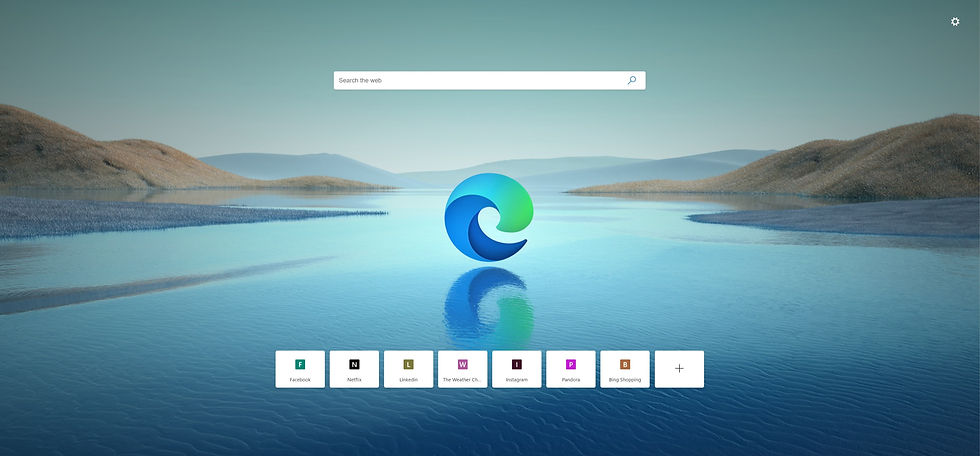
Windows decided to move forward with the wave concept as the new face of the Microsoft Edge browser. Once I handed it off to production, they changed the inner curves of the wave, as well as integrate the lime green in the top gradient. The inner counter as well as tangent points of the wave also shifted from the center after hand-off. I have also made a silhouetted version, to show the form edges clearer.
Included below are 3D renders I made in Blender, combining the new colors with more emphasis on my original silhouette.
More can be read about Microsoft's new Edge icon on The Verge.


